Graphic Design
May 2018
To mark the end of the academic year, the Department of Women’s and Gender Studies at the University of Michigan holds its Spring Symposium every May. In addition to honoring recent PhD graduates, this event allows students and faculty to discuss the tensions between feminist theory and practice.
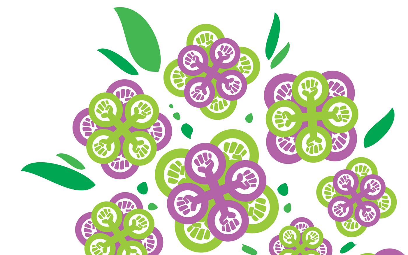
The final version of the 2018 Spring Symposium poster featured flowers made from the feminist symbol and the women's suffrage movement colors.
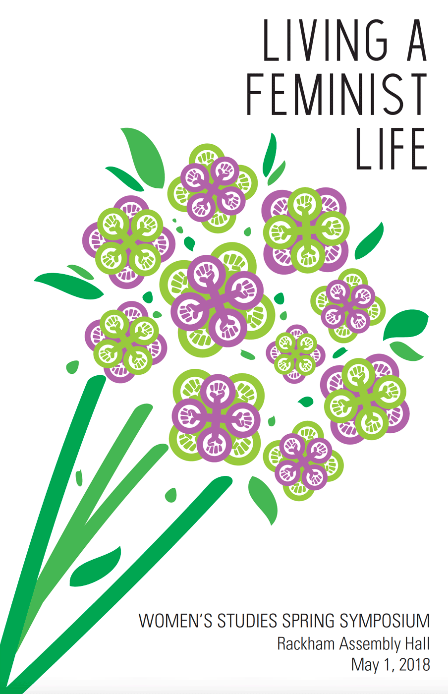
During my time as the event and communication coordinator for the Department of Women’s and Gender Studies, I organized over 70 departmental events. Among the most complicated was the annual Spring Symposium, which combined the celebration of a graduation ceremony with the intellectualism of an academic conference. In 2018, the symposium’s title was “Living a Feminist Life”—and it was my job to create a graphic identity for that theme.
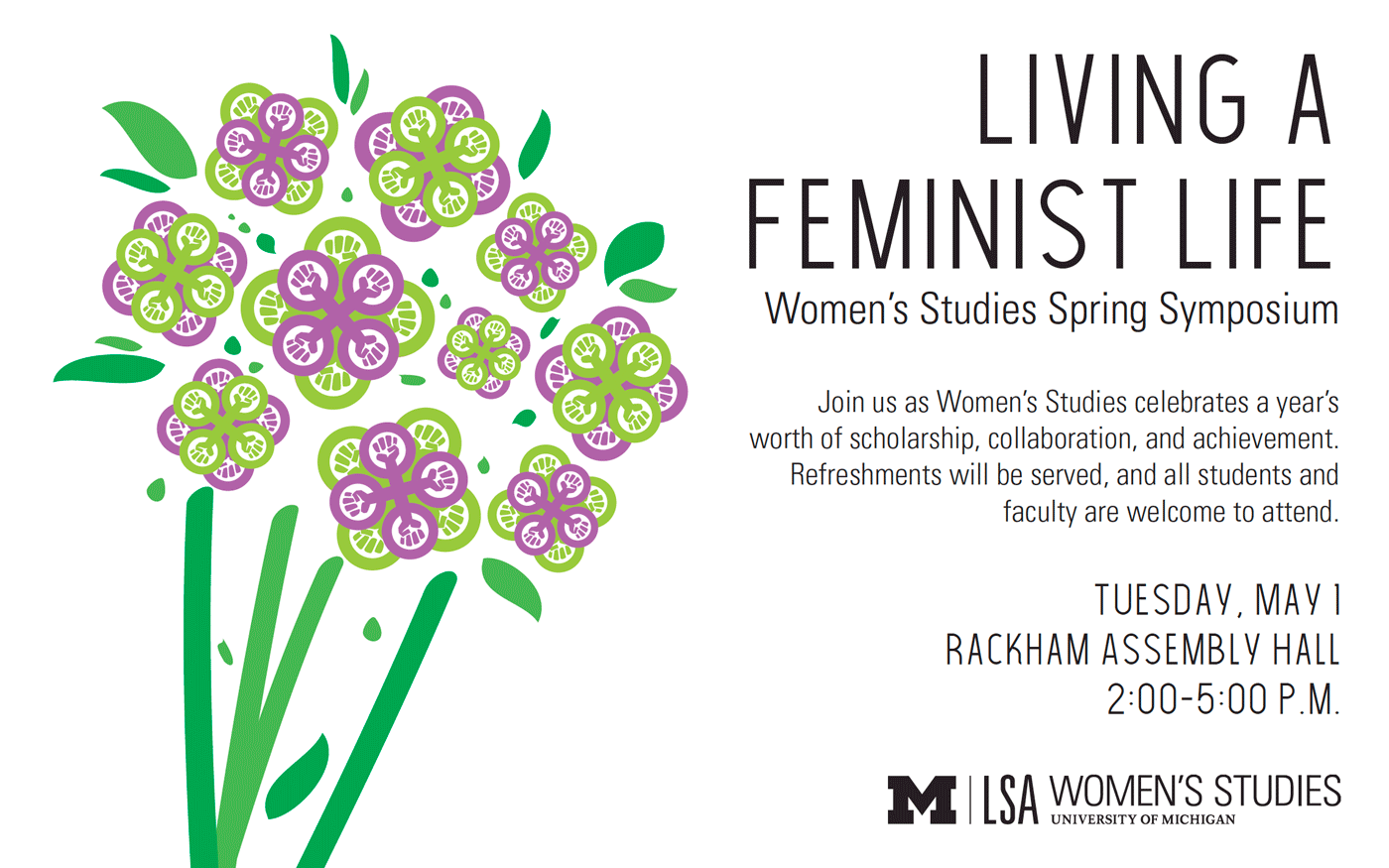
In addition to creating a poster for the event, I also prepared a digital invitation (above) and a program. Most of the events I coordinated at Michigan entailed creating multiple design formats.
One of the Department of Women’s and Gender Studies’ defining principles is that feminist scholarship should not be confined to the ivory tower—it belongs in daily life. I began thinking about everyday items that could be associated with both the department and spring. The first thing that came to mind were flowers, which were everywhere within and outside our building. Though I was initially hesitant to use a symbol associated with “traditional” femininity, I began to wonder if there was a way to subvert ideas about feminine aesthetics.
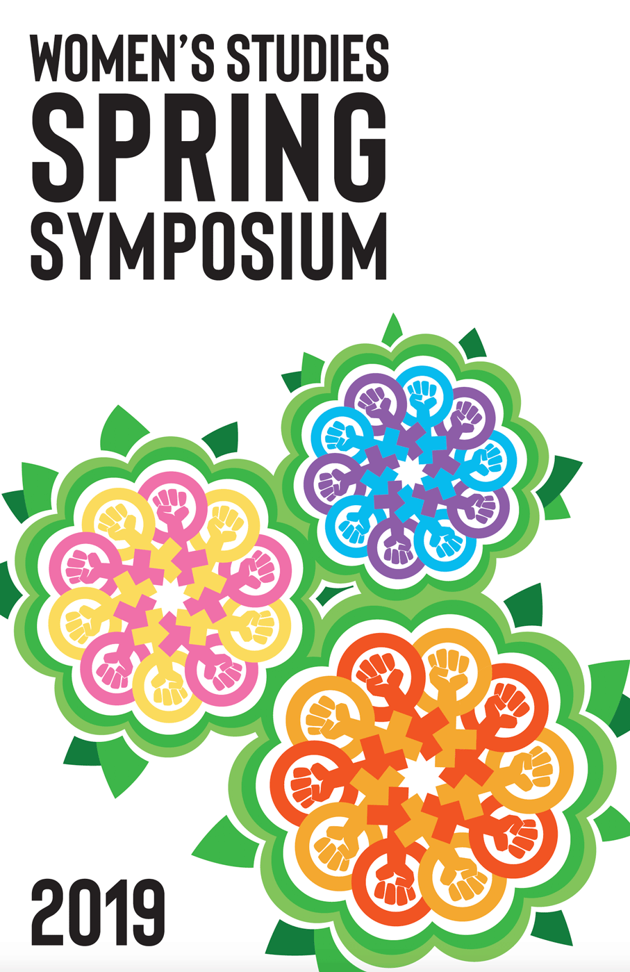
The following year, I again used the feminist symbol with a flower motif, only this time with changed petal shape and color.
The final design for the Spring Symposium made flowers out of feminism—literally. Using the feminist symbol, a fist raised in the Venus symbol, I created flower petals in purple and green, colors associated with the women’s suffrage movement.
The design was well-received by the department’s students and faculty—so much so that the chair asked for a permanent version of the poster to go up in our building. The same idea was adapted for the following year’s Spring Symposium, though I expanded the design’s color palette.